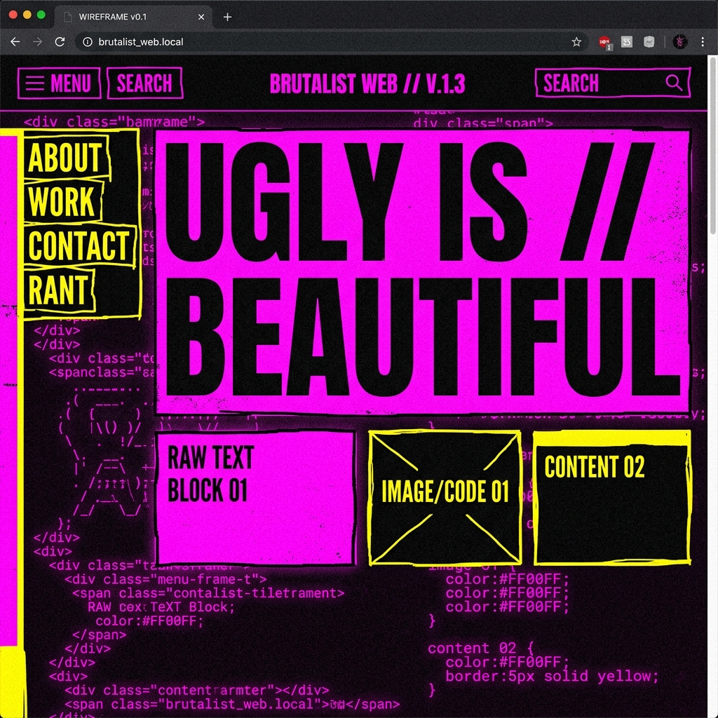
Brutalist Web Design: Why "Ugly" is the New Beautiful
If you look at corporate websites today, they all look exactly the same. Soft rounded corners, generic vector illustrations of people high-fiving near a whiteboard, lots of whitespace, and a subtle drop shadow on everything. It's safe. It's clean. And it's incredibly boring.
Enter Web Brutalism
Brutalist web design is a reaction to this homogeneity. Inspired by the architectural movement of the 1950s—which favored raw concrete and functional exposure over decorative finishes—web brutalism strips away the polite UX rules.
It embraces the raw materials of the internet: default HTML elements, harsh high-contrast colors (think #00FF00 green on #000000 black), monospaced fonts, visible grid lines, and layouts that look intentionally broken or "under construction".
Clean UI
- - Border Radius: 8px
- - Soft shadows
- - Inter / Roboto
- - #F3F4F6 Backgrounds
Brutalist UI
- - Border Radius: 0px
- - Hard 8px solid shadows
- - Space Grotesk / Courier
- - Blindingly bright accents
Why Does It Work?
In an attention economy, pattern interruption is everything. When a user lands on a brutalist site, they stop scrolling. The harshness forces them to engage because it doesn't look like the 50 other SaaS websites they've visited that day.
It also communicates authenticity. A brand that uses brutalism is saying, "We don't need to dress this up with fake corporate gloss. The product speaks for itself." It's punk rock for the web.
How I Use It
I don't recommend pure, chaotic brutalism for an e-commerce checkout page. The trick is "Neo-Brutalism". You take the visual aesthetic—hard black borders, monospaced typography, and primary colors—but you pair it with modern, buttery-smooth GSAP animations and perfect accessibility standards.
It looks raw, but it functions flawlessly. That's the sweet spot of modern frontend development.